Table of Content
The setting of the Instagram account determines the attitude of a customer towards the brand. The first impression, as you know, defines whether the customer remains or walks away surfing the internet. After reading this article you will learn how the brand positioning is shaped on the Instagram, what colors are best to use and how to plan properly the newsfeed. We will take 5 global brands, who have already set up their pages.
COS (@cosstores)
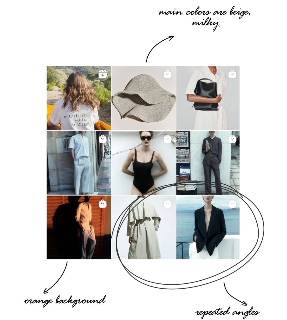
Product: modern, functional, considered design clothes
Target audience: above-average income people who appreciate architecture, design and art
Brand image: consistency, minimalism, simplicity
Post topics: new collection updates, clothes advertising.
Feed: chaotic grid layout, a lot of full length photos, blocks of 2-3 photos, B&W shots. Templates and collages aren’t used.
Colors: moderate color palette. Main colors: beige, gray, blue, green.
Accent colors: close to nature, for example, orange or blue.
Photo editing: natural, “no-filter” effect, although the feed looks attractive due to saturation and contrast.
The Instagram style reflects the brand’s philosophy – comfort, simple lines, functionality, and style. These things create the brand image, and customers know exactly what kind of product they are going to get.
Gucci (@gucci)
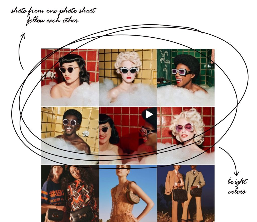
Product: high-end designer clothes
Target audience: celebrities, wealthy fashion-following people and upper class
Brand image: sophistication, innovation, luxury
Feed: several photos of the same style (from 3 to 9) are located side by side. For example, 6 pictures from one photo shoot can be placed one after the other. There are also blocks of 2-3 photos and white templates.
Main characters: models, celebrities, musicians, actors and so on. It’s essential for the brand that influencers wear its clothes, so they pay special attention to video and photo shoots.
Photo editing: competent color correction
Colors: bright and rich colors mixed with basic and natural ones. Main colors: red, pink, mint, beige, white and brown.
The Gucci Instagram account as well as the Gucci itself is bright, unique, gorgeous, as if the designer worked on it. It equally combines basic, bright and unusual colors.
Apple (@apple)
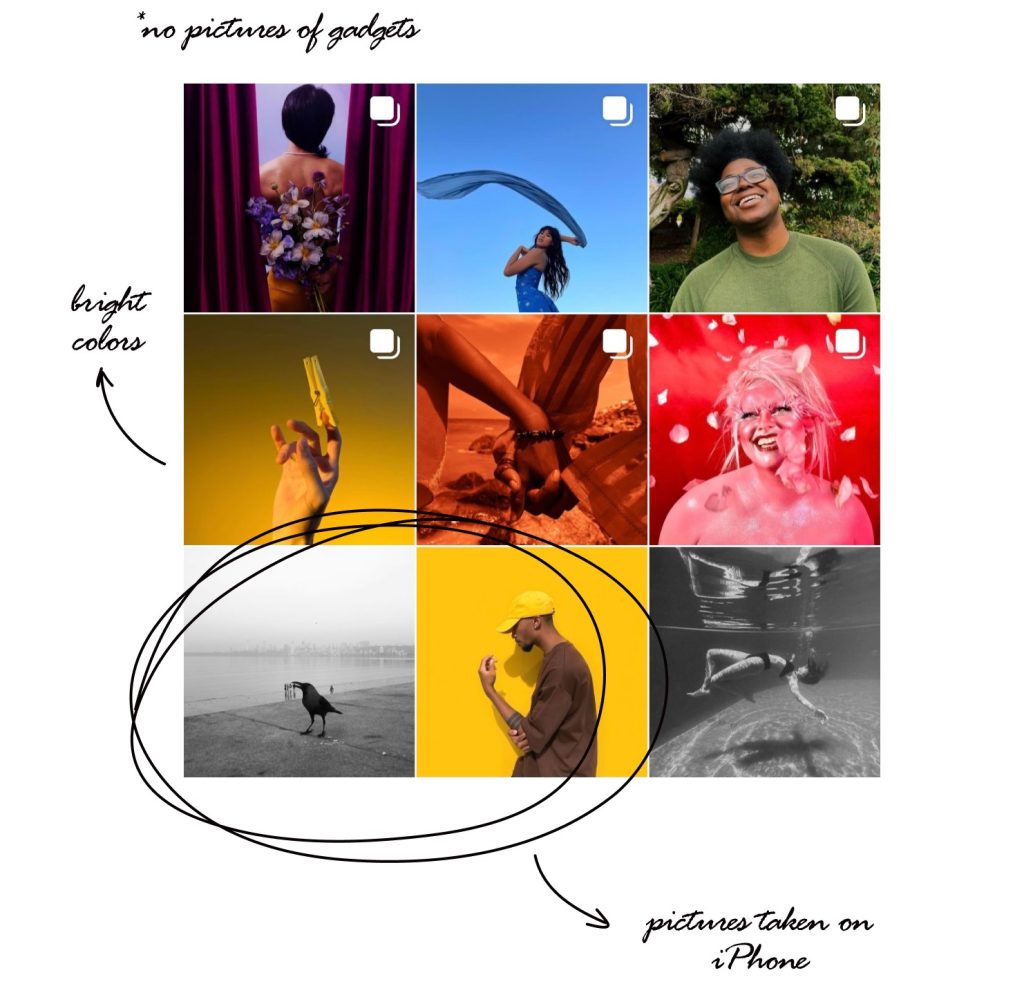
Product: electronic devices – smartphones, tablets, headphones, watches
Target audience: students, businessmen, teenagers, travelers, photographers and even housewives – people of various specialties can find everything they need in the Apple devices
Brand image: modernity, technology, convenience, style
Feed: chaotic grid layout, blocks of 2-8 photos. There are a lot of photos of professional photographers taken on their iPhones. However, Apple doesn’t post any product images.
Colors: bright and rich colors mixed with natural ones. There are also B&W photos and videos.
Photo editing: a lot of color correction
Apple creates a progressive company image that is ahead of time. It refuses to post device photos in favor of professional photos taken on an iPhone. This looks highly professional, natural and appealing at the same time.
Netflix (@netflix)
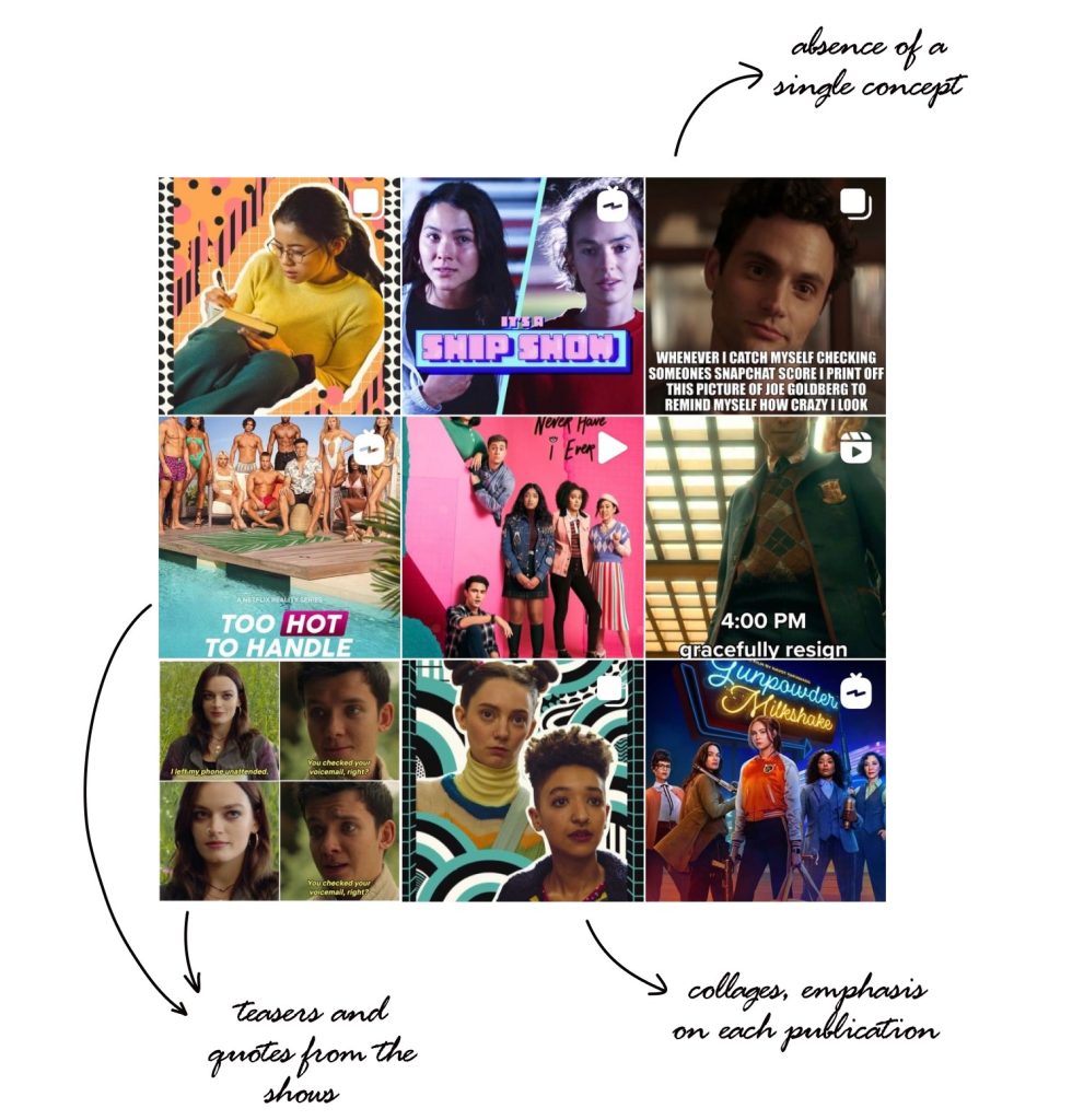
Product: movies and TV shows
Target audience: busy people, visual content lovers who want to get the most for the money spent
Brand image: a streaming platform where one can find a wide variety of high-quality video content
Feed: chaotic grid layout, photo collages and font posts. There are many screenshots of different TV shows, movie quotes and memes based on films. Announcements and photoshoots of the actors are also included.
Colors: there is no particular color concept, the brand puts emphasis not on the whole feed, but on each post specifically.
Photo editing: both yes and no at the same time. There is no editing when it comes to screenshots and memes, however official photos and announcements are edited.
It’s important for Netflix to create a friendly atmosphere and be close to its customers. Netflix doesn’t want to seem perfect or focus on the style. It appreciates jokes and quotes that are welcomed by users. There are also many behind-the-scenes photos of actors and announcements of new products.
Oreo (@oreo)
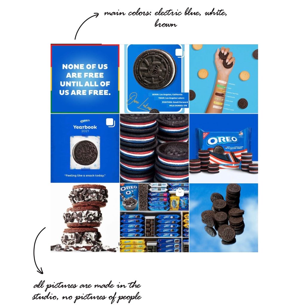
Product: cookies
Target audience: families with children
Brand image: tasty cookies for adults and kids to enjoy
Feed: chaotic grid layout, no templates, and all the photos are taken in a studio. There are no faces in the pictures as special emphasis is put on cookies. Twitter-designed quotes about cookies are posted.
Colors: several main colors – white, blue and brown
Accent colors: yellow, pink, red and green – all of them are well combined with the basic ones.
Photo editing: as all the photos are taken in a studio, the brand doesn’t try to look natural. Instead, it attracts customers using bright and juicy product’s shots.
Oreo chooses the main product’s colors and makes no attempt to be natural. Their feed is juicy, bright and “delicious”. You want to buy a pack of Oreos and enjoy the taste the second you look at their feed.
The most important thing is to describe your brand’s philosophy and follow it while creating a feed.
Use Ninetales to edit your photos. The app has plenty of options: templates and textures that were designed to help you reflect the concept of your blog!
