
Table of Content
Recently, we had a chance to talk to Sofia Dozorets about visual aesthetics. Let’s discuss why you need visual content and how to avoid mistakes when developing it.
Why do you need visual content?
If you want to increase the number of followers or improve sales, you have much work to do – just a beautiful picture isn’t enough: conduct market research, introduce high-quality products, build a personal brand, develop a content plan, etc.
Then why are we talking about visual content?
Visual content is a crucial ingredient in your marketing strategy, and you can’t skip this important step. You have to put much effort into creating your visual content. Then it’ll be easier for you to attract new followers, build a connection with the audience, collaborate with bloggers and influencers.
There are several common visual content mistakes
1. Misunderstanding of goals
You should understand what your goals are and build a visual strategy (and any other strategy) taking into account your plans. Do you want a personal blog or a business account? Do you want to sell ads or your product? What kind of product? What kind of advertising? When you answer all these questions, you can think about visuals. Visual content should align with both your goals and trends.
2. Misunderstanding of trends
Trends are good for promotion but you have to be careful while following them. You shouldn’t turn your page into a trends collection – and that’s for certain. Don’t lose your blog identity, it should be unique and special. Some trends are right for your blog, others not. Pay attention to those that fit your visual aesthetics, general mood, and even better, bring something new to them. If you’re an influencer who loves nature and natural colors, trends for naturalness are for you. But there is no need to chase this trend if your product is far from it.
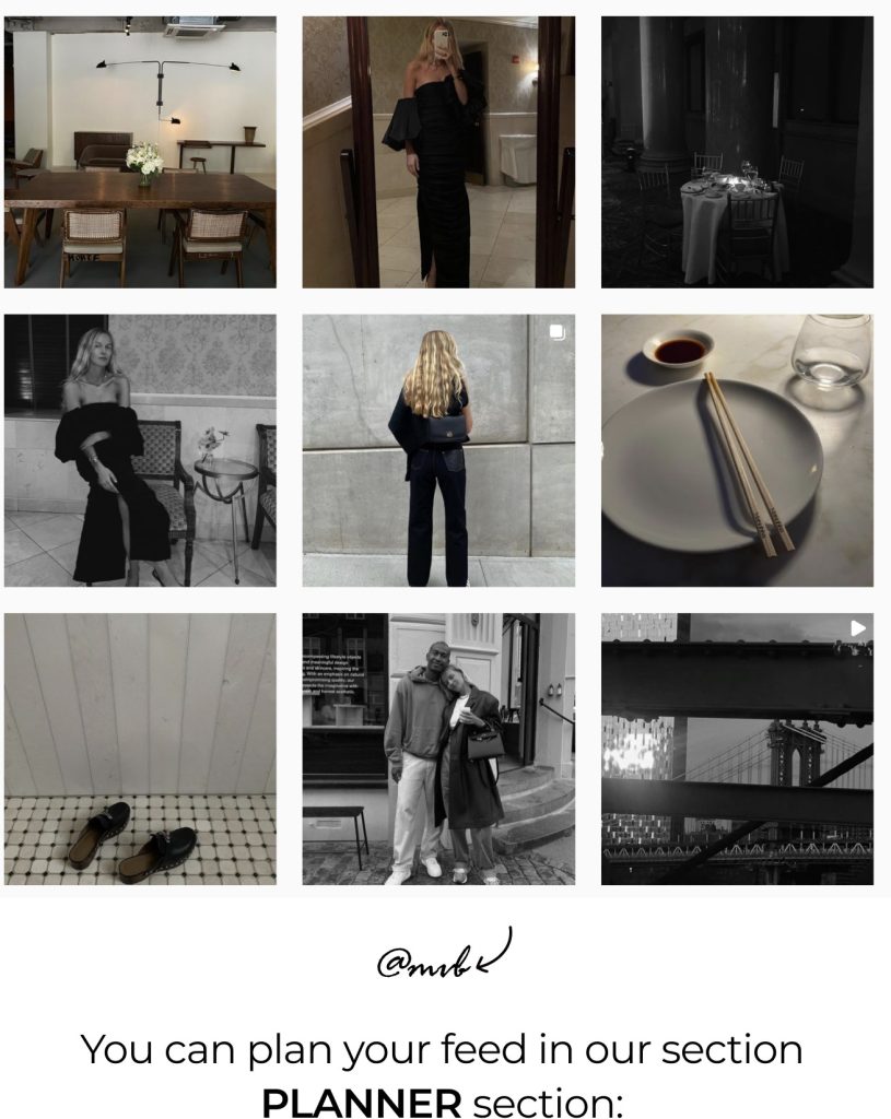
3. Lack of planning
Once you define your goals and concept, plan your content and don’t publish all posts in a row. Use a planner to create an aesthetically pleasing profile.
Be intentional with visuals and try to find suitable locations for photos. Lack of planning puts your visual content at risk – with no chance of being balanced it’ll end up being ‘too much’. It doesn’t mean that you should forget about different styles – posting similar pictures all the time isn’t a winning strategy as well.
4. Bad composition
Too many details or, on the contrary, the lack of them, the wrong combination of textures, colors or light – all of them are indicators of bad composition. We often discuss with bloggers how to work with these elements. A trained eye and practice are also helpful. Start right now with our planner!
5. Bad photo editing
Like any other part of social media strategy, editing should be high-quality and meet your needs. It’s better to choose one concept of editing so that your grid is designed in similar colors and light. The most important thing to take into account is that no creative editing justifies the loss of information in the shot (overexposure, underexposure, etc.), so pay attention to it.
6. Lack of using references
Imagine that you’ve pictured desirable results in your mind, and now it’s time to get references! They allow you to clearly formulate tasks, come up with something new, as well as analyze already designed visuals. We told you how to work with references in this article.
What’s a good visual?
Don’t forget about the following elements to create a beautiful visual:
Concept + analytics + a trained eye + relevance + references
A perfect visual is content that aligns with your project concept, it’s fresh, relevant and unique. Visuals should reflect your personality, brand core, current moods and trends (but don’t copy them).
Visual content is an important tool that helps you attract users and tell them about who you are. But don’t forget about other parts of social media strategy – they should be well-prepared and follow your values.