Table of Content
When working with a personal brand, special attention should be paid to its visual side. The first impression of the user depends on it, as well as whether he or she wants to follow your page. But how do you create the perfect visual that’s right for you? We analyze how popular influencers approach this issue.
1. Zendaya (@Zendaya)
Actress, singer, dancer, model and everyone’s favorite.
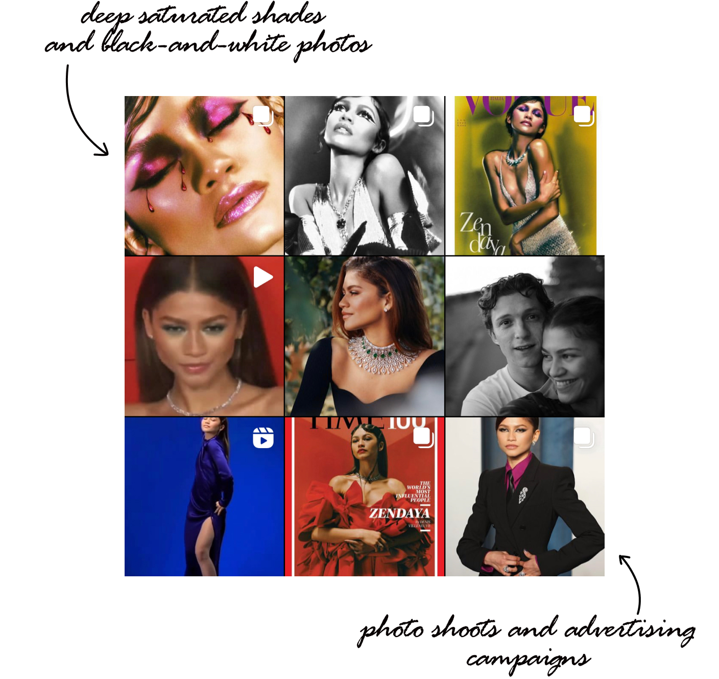
Blog format: cooperation with global brands, photo shoots and advertising campaigns. She also uses Instagram to talk about her personal life and share news.
Image: sophistication, brightness, there is even high fashion (covers, large photo shoots). Along with this, she posts her ordinary life wearing everyday clothes.
Topics: photo shoots, red carpets shots, ordinary life.
Feed: chaotic arrangement, sometimes blocks of 2-3 photos are used, “live” as if not a thought-out feed.
Color scheme: deep saturated shades contrast with black-and-white photos that can be seen at least once in a row.
Textures: many textures, close-ups, large bright spots that are balanced by black and white photos.
Photo editing: Most of the pictures are edited by professional photographers. The contrast is remarkable. Everyday pictures are more often black and white or have a film camera effect.
Zendaya is a bright, successful and attractive girl who knows how to be one of us through and through. She is talented and “one of us”, which she actively broadcasts in her feed. Seeing this feed, users immediately understand who is in front of them. You want to study her feed – so bright and original it is.
2. Марина Басистая (@basechkaa)
Videographer, photographer, influencer, creator of the author’s course on shooting and video editing.
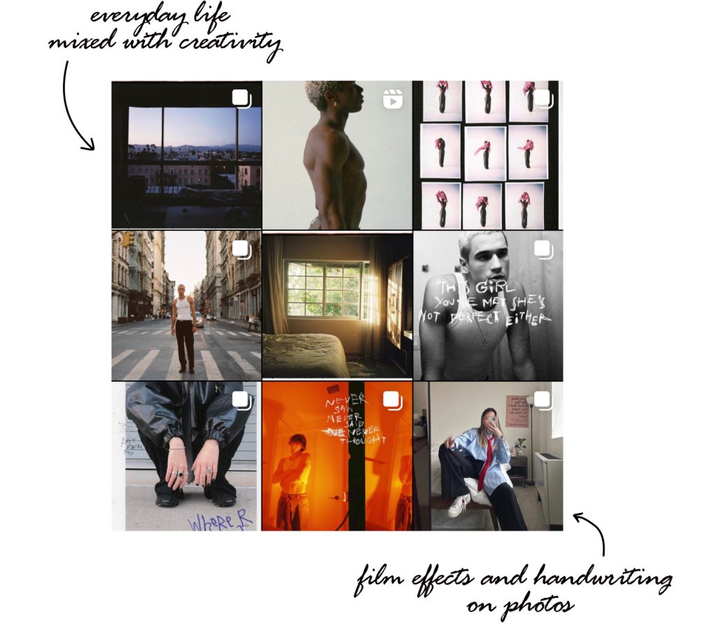
Blog format: her works, collaborations with brands and models, advertising her own product in the blog.
Image: style, creativity, everyday life are laconically intertwined with Marina’s bright and memorable works as an author.
Topics: creative shoots, outfits, representing yourself as a photographer/videographer, and just an ordinary person with individual features.
Feed: chaotic arrangement, and photos with different basic color solutions rarely stand side by side. It somewhat resembles a chess order, but that’s not it: the drawing periodically gets lost. A kind of chaotic order. The feed doesn’t look thought out in advance, but it doesn’t deprive it of harmony.
Color scheme: there are several basic colors: warm shades of yellow and green, lilac, shades of red, black and white.
Photo editing: Marina likes to edit with a “film effect”, which often gives her works texture, with handwritten signatures on top of the pictures. Shades of medium saturation are more likely to go into pastel, while the feed doesn’t lose its brightness due to the combination of radically different colors in one feed.
The feed is stylish, but not flashy. Marina, as a person whose task is to attract attention to her work, often shares it with them – her shootings. Nevertheless, she’s not afraid to publish pictures with her face, so that users can see who exactly creates such works, and can get to know her better.
3. Oljia Ryzevski (@oljaryz)
Influencer, blogger, photographer.
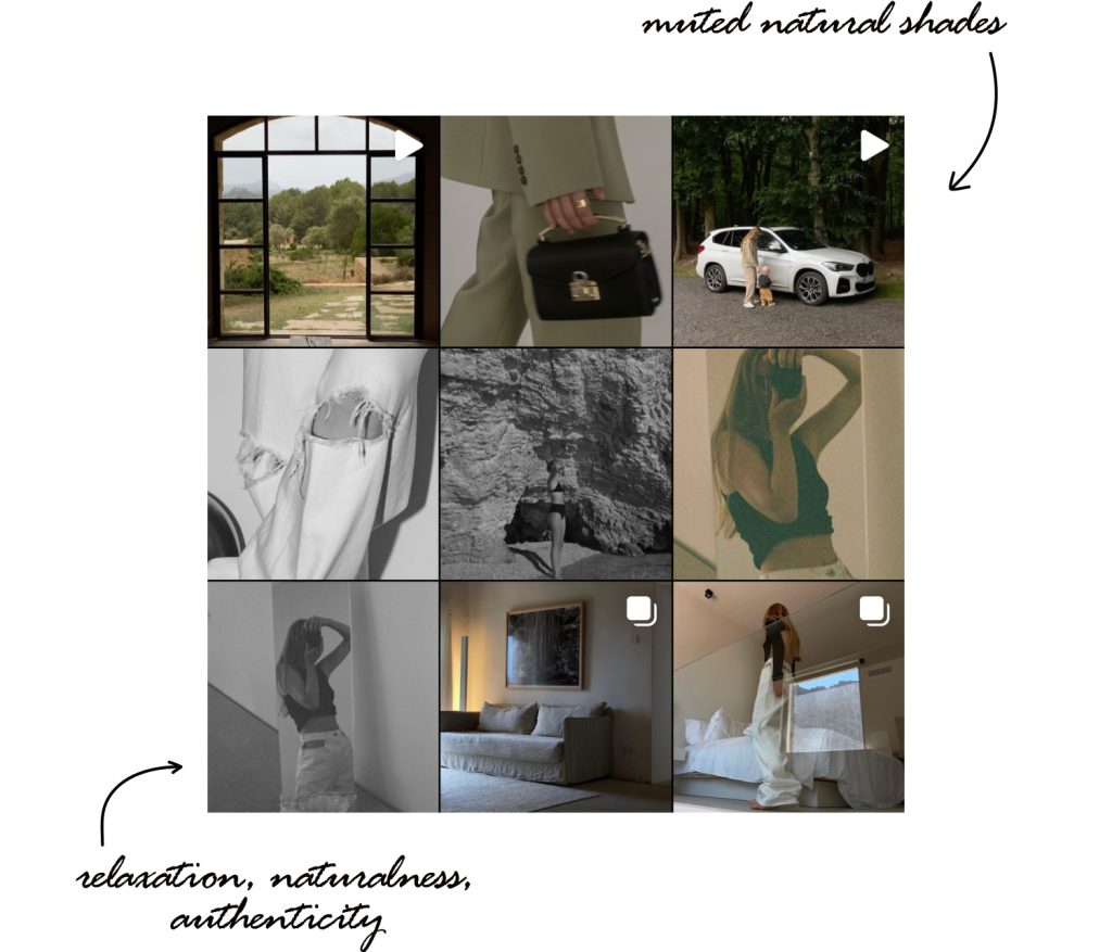
Blog format: collaboration and content creation for global brands, travel.
Image: relaxation, naturalness, authenticity and lightness
Topics: travel, creative agency development, broadcasting interesting landscapes, natural objects.
Feed: chaotic arrangement, one photo can stand next to a similar one, “enlarging” the original one.
Color scheme: muted natural shades are used. The feed looks dark, while it often contains natural objects with their natural color and reduced exposure. There are also black and white pictures and bright color accents, for example, orange.
Textures: lots of different textures, large spots, less minimalistic frames.
Photo editing: most of the photos have reduced exposure. Contrast is present, but not strong.
The profile attracts attention, and reflects the inner world of the influencer. The inclination to naturalness and the ability to present the surrounding reality in your own style – that’s what we can see in her blog. The ideal feed for working with large orders.
4. Ziqian Liu (@ziqianqian)
Photographer.
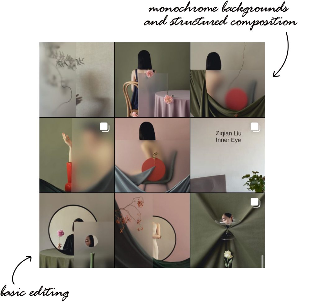
Blog format: representation as a photographer, cooperation with global brands.
Image: clear lines, sophistication, femininity, beauty.
Topics: photo works of the author
Feed: structured in a staggered manner, while it doesn’t look trite and obvious due to shades in the photos.
Color scheme: green, pink, dark brown details. The author works with the same colors and similar subjects, which creates unity and harmony.
Textures: monochrome backgrounds and a structured composition of frames create a good feed structure.
Photo editing: the author uses basic processing that hides the shortcomings and emphasizes advantages. All frames are of approximately the same brightness, contrast and intensity (medium).
The author gives a clear understanding of what the result will be if you turn to her. Despite the fact that we don’t see the photographer herself and her personality, her perception of the world can be traced through the photos. The profile is harmonious, structured, catches the eye and invites the viewer to stay.
5. Jack Morris (@jackmorris)
Businessman.
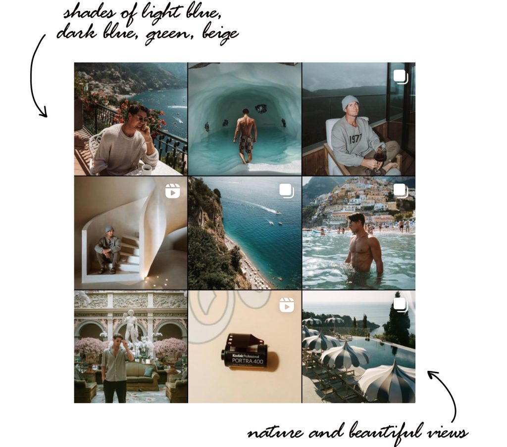
Blog format: travel, daily life, reflecting Jack’s interests.
Image: nature, beautiful views, relaxation.
Topics: travel, daily life.
Feed: chaotic, natural, no rigid structure. At the same time, it looks like a whole.
Color scheme: shades of light blue, dark blue, green, beige. Because of the color scheme, the profile looks harmonious.
Photo editing: often images have a “film effect” and are artificially aged. The chosen color scheme looks advantageous, but at the same time the colors are not intense, rather restrained.
This is the entrepreneur’s personal page, which broadcasts not his product, but his personality, character, and daily (very active) life. It seems that he’s successful, but he doesn’t brag about it. There is a desire to find out what he’s doing, what product he’s working on.
Each feed has its own goals that need to be achieved. Having understood it, choosing the main idea, blog theme, colors and editing, it’ll be easier for you to create a feed. But it’s unlikely that you’ll succeed without a convenient planner, which is available in Ninetales. Use all our features to create the visual that’s right for you!
